Arroz
Arroz delivers a captivating culinary journey where a rich tapestry of Spanish flavours unfolds in the heart of Saudi Arabia. Celebrating the historical connection between Spanish and Arab cultures, the Arroz concept centres around the iconic rice-based dish, paella. With open wood fire stoves as the centrepiece, talented chefs craft paellas infused with smoky aromas and tantalising flavours.
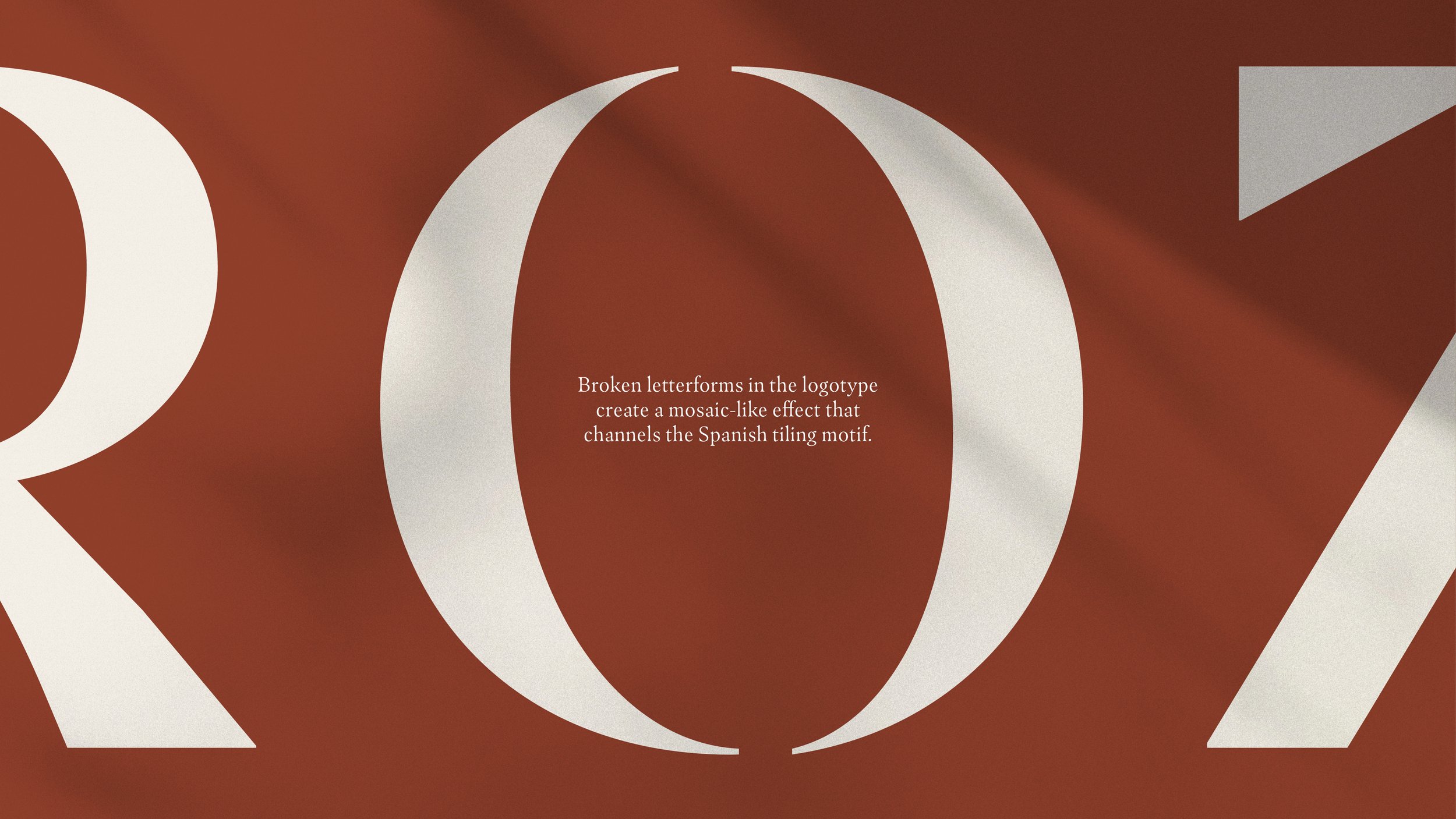
The visual identity was inspired by the mosaic-like organic shapes found in Spanish tiling, representing the joining of Spanish and Arab traditions that defines the Arroz culinary concept.
Rather than focussing on traditional patterns, inspiration was taken from simplified tilework which combines muted earthy tones and abstract shapes.
Shape assets are an important tool in the visual language for the Arroz brand. Inspired by expressive tilework, the shapes are composed of clean lines and geometric figures, which interact with each other to create new and dynamic forms.
The shapes are softened by added texture and the earthy colour palette which supplies a warmth and gives a more crafted quality to the overall look and feel.
The Arroz colour palette exudes warmth and ease, with earthy tones that feel grounded and natural.
Assigning an individual core colour to communicate the different categories of food on offer, the Arroz palette guides guests though menu navigation and helps to structure the Arroz comms.
Takeaway packaging promotes a strong brand presence with economical solutions. A more muted use of the colour palette creates packaging with a sense of ease and simplicity.
Staff uniforms hone in on the crafted nature of the brand with a casual yet refined style. Earthy green and cream combine to create a timeless and modern look.


